HRMS Dashboard Overview
The HRMS Employee Dashboard provides a comprehensive, real-time view of your attendance, leave balances, celebrations, and project assignments — all from a single page.
Dashboard Layout
The dashboard is rendered as a client-side Owl JavaScript component (not a standard Odoo form view). It is divided into four main areas:
| Area | Position | Contents |
|---|---|---|
| Header | Top of the page | Month navigation arrows (left and right buttons), current month name, and current year |
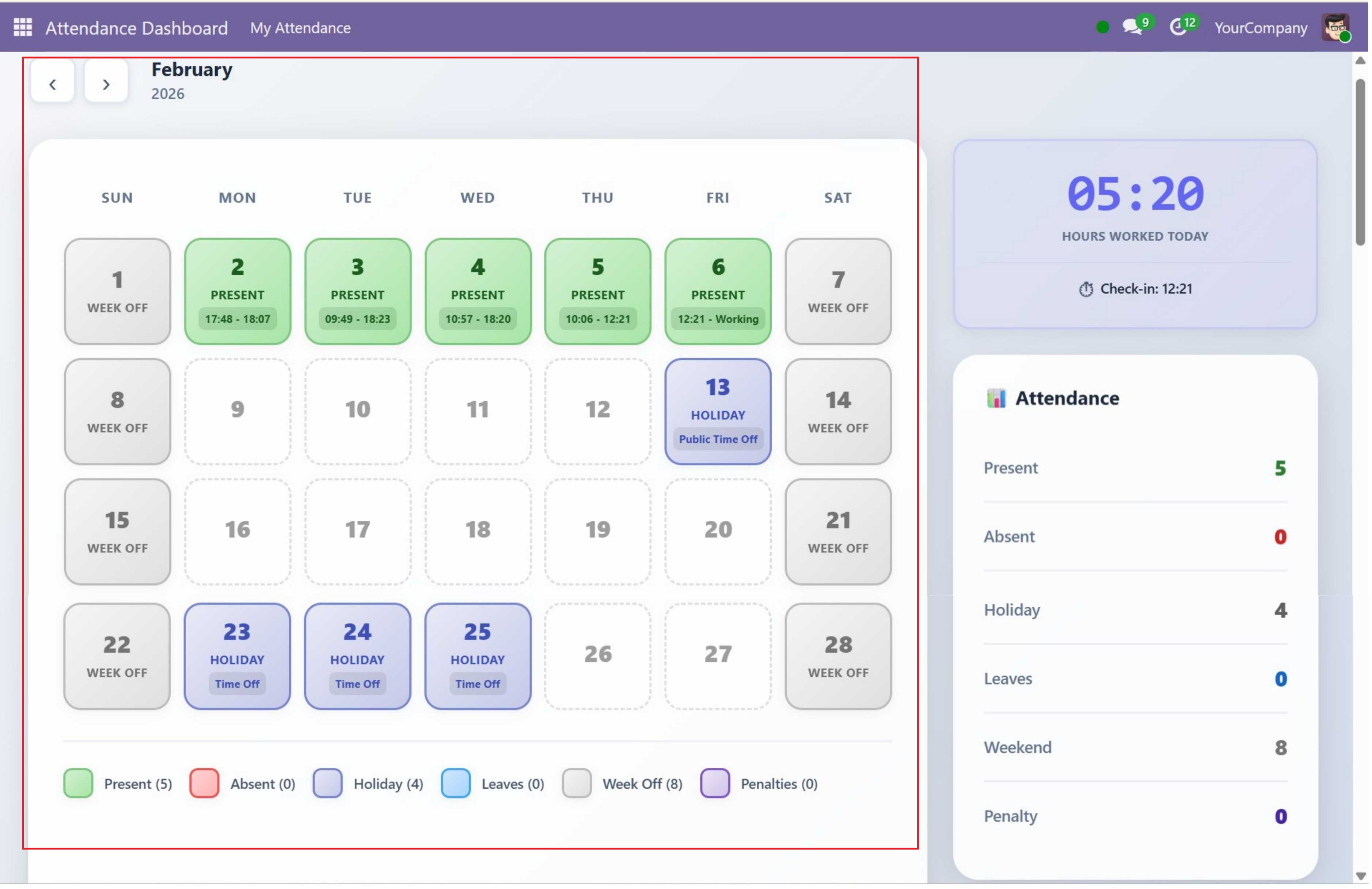
| Calendar Section | Main content area (left) | 7-column calendar grid (SUN, MON, TUE, WED, THU, FRI, SAT) showing each day as a cell with date number, status label, and time info. Below the grid is a color-coded legend with status counts. |
| Sidebar Section | Right side of the calendar | Three stacked panels: (1) Work Timer Widget with large HH:MM display and "HOURS WORKED TODAY" label, (2) Attendance Statistics Panel with 6 color-coded metrics, (3) Leaves Panel with "CURRENT BALANCE" heading and remaining days per leave type |
| Bottom Row | Full-width below calendar + sidebar | Two side-by-side panels: (1) Celebrations Panel for upcoming birthdays and work anniversaries, (2) Projects Panel for assigned projects with task stage breakdown |
If the logged-in user is not linked to an employee record, the entire dashboard content is hidden and replaced with a yellow warning box showing a 5-step fix guide.
Menu Navigation
After installation, the module creates a dedicated top-level menu in Odoo:
- Root Menu: Attendance Dashboard — appears in the main Odoo top navigation bar (sequence 10)
- Sub Menu: My Attendance — the only sub-item under the root menu. Clicking this opens the client action that renders the full attendance dashboard
The navigation path is: Attendance Dashboard > My Attendance
Feature Overview
| Feature | Description |
|---|---|
| Attendance Calendar | Color-coded monthly calendar showing attendance status for each day at a glance |
| Live Work Timer | Real-time counter tracking hours worked today with accumulated time across check-ins |
| Statistics Panel | Instant monthly summary with counts for present, absent, holiday, leave, and weekend days |
| Leave Balances | View remaining leave days by type with clear allocated vs. consumed breakdown |
| Celebrations | Track upcoming birthdays and work anniversaries within the next 30 days |
| Projects & Tasks | View your assigned projects with task breakdown by stage and overall status |
Attendance Calendar
The centerpiece of the dashboard is a monthly attendance calendar laid out in a 7-column grid running Sunday through Saturday. Each day cell displays:
- Date number — The day of the month
- Status label — One of:
Present,Absent,Holiday, the leave type name (e.g. "Casual Leave"),Week Off,Penalty, or empty (for future dates) - Time info — For present days: shows the first check-in time and the latest check-out time (e.g. "09:00 - 18:00"). If still checked in, shows "09:00 - Working". For holidays: shows the holiday name.
Status Priority Logic
When determining the status for a day, the system checks in the following priority order:
| Priority | Status | Condition |
|---|---|---|
| 1 | Weekend | Saturday (5) or Sunday (6) — always marked as "Week Off" |
| 2 | Holiday | Date exists in resource.calendar.leaves (company-wide or employee-specific) |
| 3 | Leave | Date has an approved leave request (hr.leave with state = "validate") |
| 4 | Present | At least one attendance record exists for the date |
| 5 | Future | Date is after today (no status label shown, dashed border styling) |
| 6 | Absent | None of the above conditions match (past working day with no attendance or leave) |
Calendar Legend
Below the calendar grid, a color-coded legend is displayed showing each status with its current month count:
| Color | Status |
|---|---|
| Green | Present |
| Red | Absent |
| Purple | Holiday |
| Blue | Leave |
| Gray | Weekend |
| Dark Red | Penalty |
Month Navigation
The dashboard header contains left and right arrow buttons for navigating between months.
| Button | Behavior |
|---|---|
| Left Arrow | Moves to the previous month. If January, wraps to December of the previous year. |
| Right Arrow | Moves to the next month. If December, wraps to January of the next year. |
When navigating, the calendar, statistics, and legend are all reloaded for the selected month. The month name and year are displayed in the header between the arrow buttons. On initial load, the dashboard defaults to the current month and year.
The Work Timer, Celebrations, and Projects panels are not affected by month navigation — they always show current/live data regardless of which month is being viewed in the calendar.
Notifications
The dashboard uses Odoo's built-in notification service to display toast messages for user actions. These appear as temporary pop-up messages in the top-right corner of the screen.
| Action | Message | Type |
|---|---|---|
| Check In | "Checked in at HH:MM" | Success (green) |
| Check In (duplicate) | "Already checked in at HH:MM" | Warning (yellow) |
| Check Out | "Checked out at HH:MM" | Success (green) |
| Check Out (no check-in) | "No active check-in found. You are already checked out." | Warning (yellow) |
Loading & Empty States
Loading State
While attendance data is being fetched from the server, the dashboard displays a centered spinner animation with the text "Loading attendance data..." below it. This appears during initial page load and when navigating between months.
Empty States
When specific panels have no data to display, they show helpful placeholder messages:
| Panel | Empty State Message | When Shown |
|---|---|---|
| Leave Balances | "No leave allocations found" | No approved leave allocations for any leave type |
| Celebrations | "No upcoming celebrations in the next 30 days" | No birthdays or work anniversaries within 30 days |
| Projects | "No projects assigned" | User is not assigned to any tasks in any project |
Responsive Design
The dashboard is fully responsive and adapts to different screen sizes:
| Screen Size | Breakpoint | Layout Behavior |
|---|---|---|
| Desktop | > 1200px | Full layout: calendar grid (7 columns), sidebar on the right, bottom row with two side-by-side panels |
| Tablet | 768px – 1200px | Calendar and sidebar stack vertically. Bottom panels may stack. |
| Mobile | < 768px | Single-column layout. Calendar cells become compact. All panels stack vertically. Touch-friendly sizing. |
The module uses CSS variables for theming and glassmorphism design effects (gradients, backdrop filters, subtle shadows) for a modern, premium look across all screen sizes.
Contact SDLC Corp at sdlccorp.com/contact-us or email sales@sdlccorp.com