Colors & Dark Mode
Personalize the theme with 12 built-in color palettes, custom colors, gradient backgrounds, UI styles, and full dark mode support.
Accessing Theme Settings
Click the gear icon in the top bar or press Alt+T to open Quick Settings.
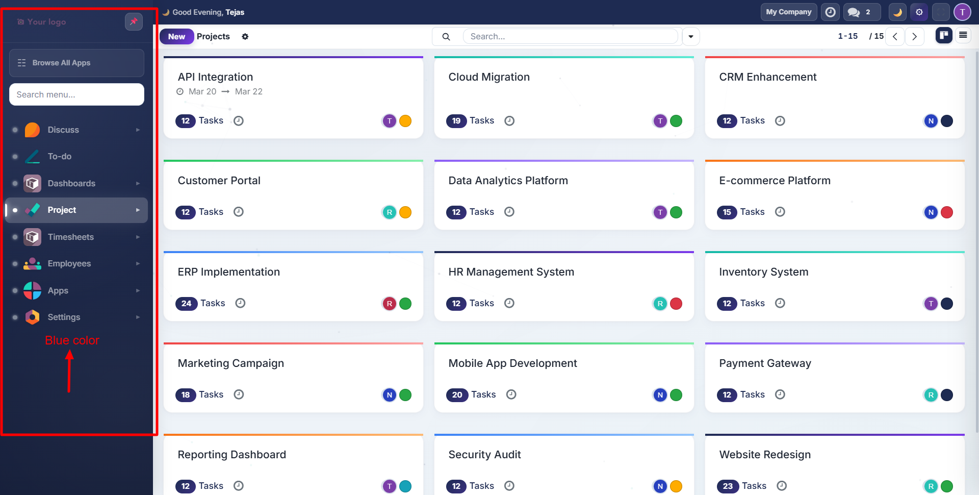
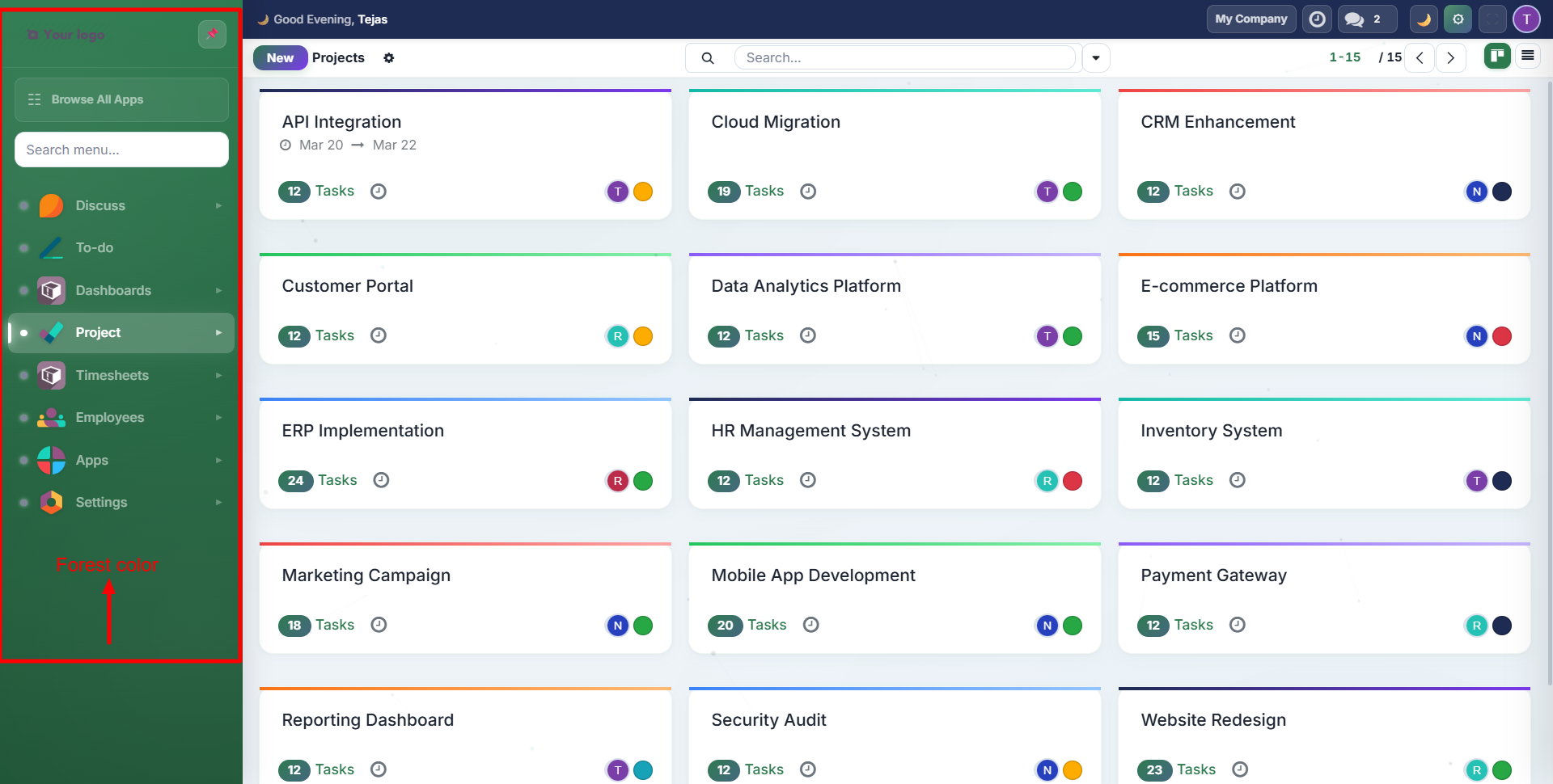
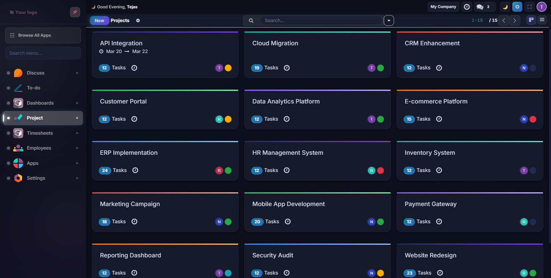
Color Palettes
Choose from 12 pre-built palettes in the Quick Settings panel. Each palette changes the primary brand color used throughout the UI: buttons, links, sidebar accents, and active states.
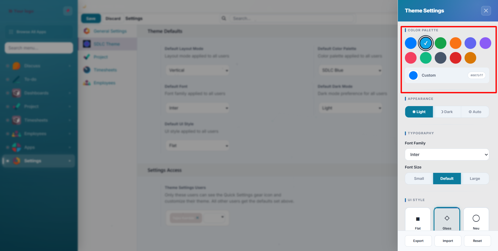
| Palette | Primary Color | Best For |
|---|---|---|
| Default | Navy blue | Professional, corporate |
| Ocean | Deep blue | Clean, calming |
| Forest | Green tones | Nature, sustainability |
| Sunset | Warm orange | Creative, energetic |
| Midnight | Dark blue-black | Focused, minimal |
| Lavender | Purple | Modern, premium |
| Coral | Pink-orange | Friendly, warm |
| Emerald | Rich green | Finance, growth |
| Slate | Cool grey | Neutral, balanced |
| Crimson | Deep red | Bold, urgent |
| Amber | Gold-yellow | Warm, attention-grabbing |
| Custom | Your choice | Full control |
Palette Examples
Default (SDLC Blue): the standard professional look:
Ocean: a calming teal/cyan tone:

Forest: nature-inspired green:
Custom Colors
When you select Custom, three color pickers appear for full control:
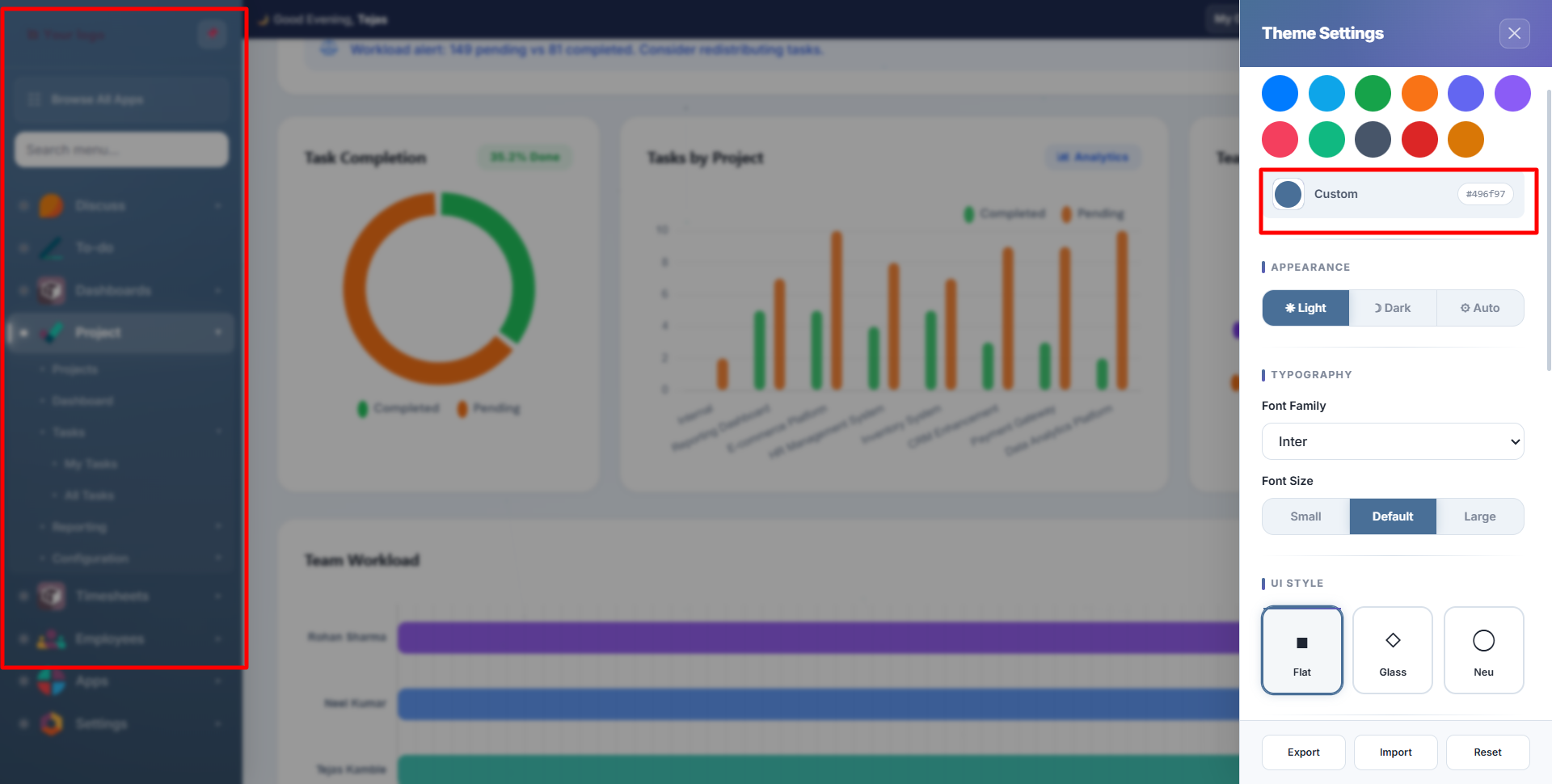
- Primary: main brand color (buttons, links, active states)
- Secondary: supporting color (backgrounds, borders)
- Accent: highlight color (badges, notifications, hover states)
Enter hex values directly or use the color picker.
Dark Mode
Three dark mode options are available in the Appearance section of Quick Settings:
Light Mode: standard bright background:

Dark Mode: full dark theme with optimized colors:
| Mode | Behaviour |
|---|---|
| Light | Always light background |
| Dark | Always dark background with adjusted colors for readability |
| Auto | Follows system preference + smart ambient mode (dark 8pm-6am, light 6am-8pm) |
Toggle dark mode instantly with Alt+D or click the moon icon in the top bar.
Dark mode is a true dark theme: not just inverted colors. All surfaces, shadows, charts, and components are individually optimized for readability in dark mode.
UI Styles
Choose from three distinct surface treatments in Quick Settings:
Flat: clean, minimal design with no depth effects:
Glass (Glassmorphism): frosted glass cards with blur and transparency:
Neumorphism: soft raised/inset surfaces with subtle shadows:
Gradient Backgrounds
Add subtle animated gradients behind your workspace from the Quick Settings panel:
| Gradient | Effect |
|---|---|
| None | Solid background |
| Aurora | Green-blue northern lights |
| Sunset | Warm orange-pink |
| Ocean | Deep blue waves |
| Neon | Purple-cyan glow |
| Forest | Green organic tones |
Theme Export, Import & Reset
At the bottom of the Quick Settings panel, you'll find three actions:
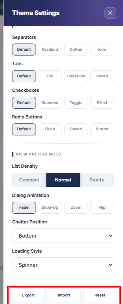
- Export: saves your entire theme configuration as a downloadable JSON file
- Import: load a previously saved theme JSON file to apply it instantly
- Reset: restore all settings to the global defaults set by your administrator
Use Export/Import to share consistent theme configurations across your team or organization.
Contact SDLC Corp at sdlccorp.com/contact-us or email sales@sdlccorp.com