Layout & Typography
Configure sidebar layout, font families, component styles, and view density settings.
Layout Modes
The theme offers two sidebar layout modes, switchable from Quick Settings:
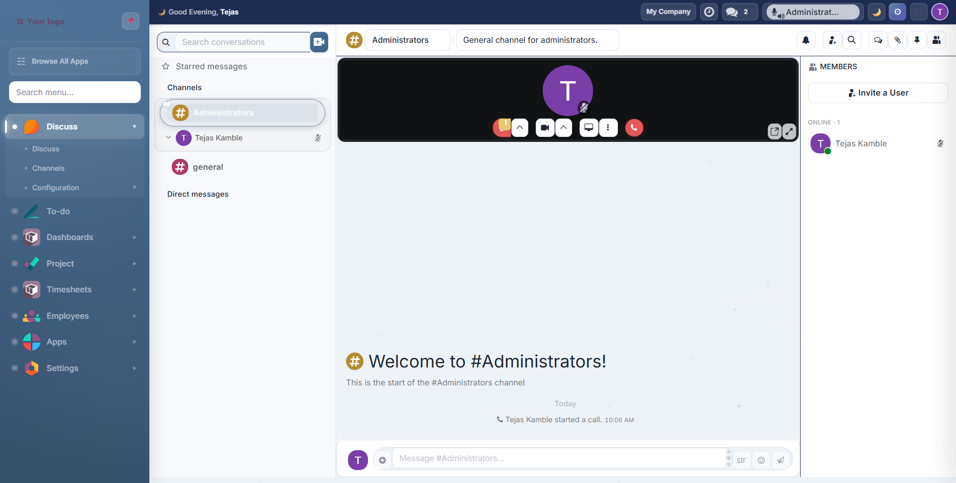
Vertical Layout
Full sidebar with app icons, labels, search, and sub-menus. The default experience.
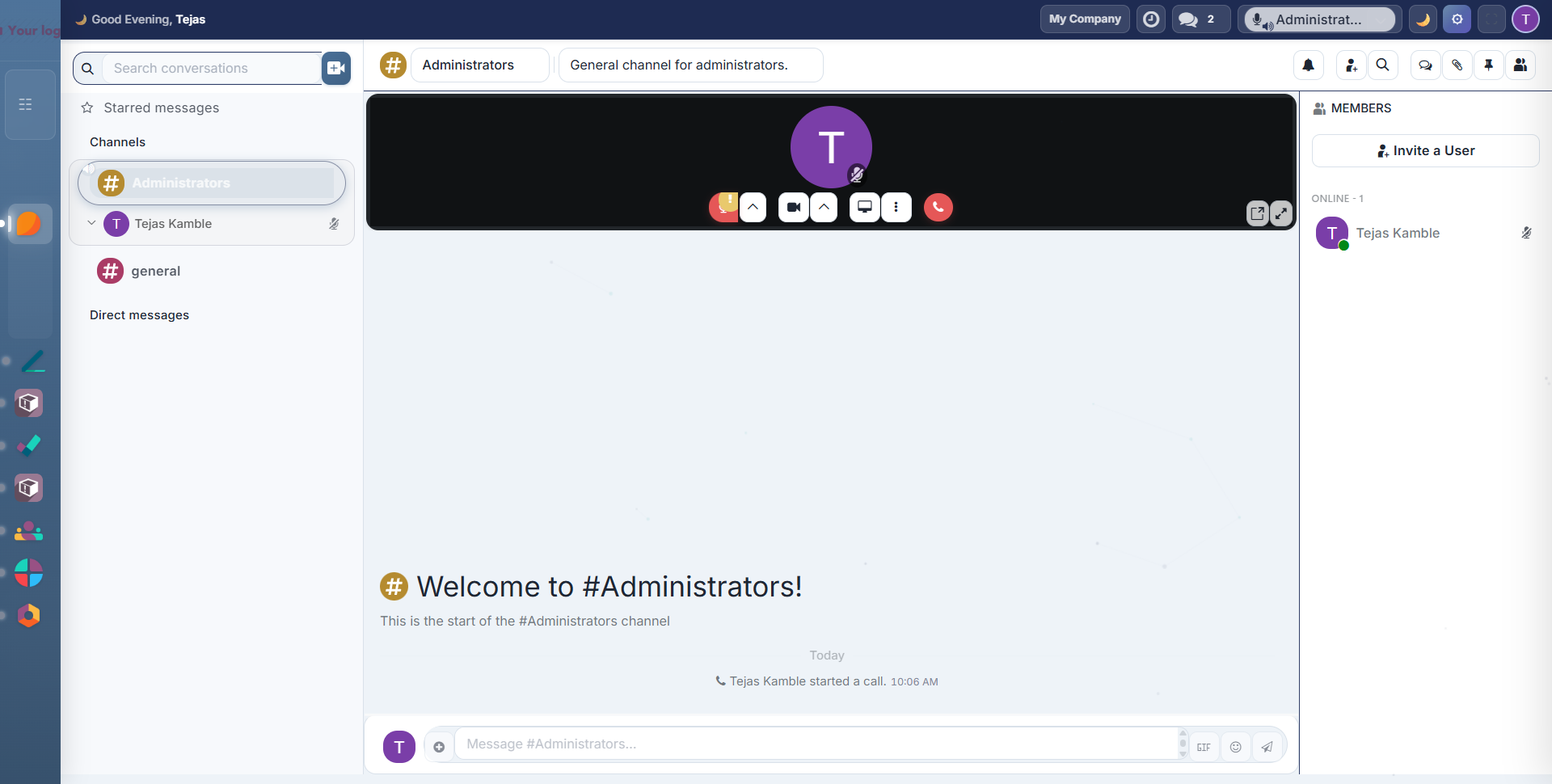
Mini Layout
Compact icon-only sidebar that saves horizontal space. Labels appear on hover.
Sidebar Features
Pin/Unpin: click the pin icon in the sidebar header to toggle between pinned (always visible) and unpinned (auto-collapse) modes:
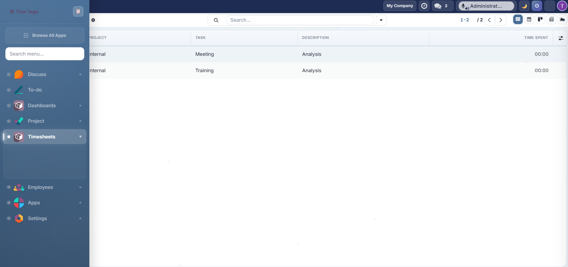
When unpinned, the sidebar collapses to a thin icon strip and expands when you hover over it.
Search: type in the sidebar search box to instantly filter apps and menu items:

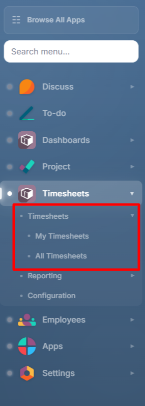
Sub-menus: click any app with children to expand its sub-menu inline:
Mini Stats: the sidebar footer shows a task completion percentage (auto-refreshes every 5 minutes when the Project module is installed).
Time-Based Greeting: the sidebar footer displays a personalized greeting: "Good Morning", "Good Afternoon", or "Good Evening" based on the time of day.
Top Bar
The top bar spans the full width above the content area, providing quick access to key actions:

| Element | Description |
|---|---|
| Greeting | "Good Morning/Afternoon/Evening, [Name]" with emoji |
| Company Switcher | Displays current company name, click to switch |
| Messaging | Chat notification icon with unread count badge |
| Dark Mode Toggle | Moon icon to toggle dark/light mode (Alt+D) |
| Gear Icon | Opens Quick Settings panel (Alt+T): visible only with Settings Access |
| Fullscreen | Toggle fullscreen mode (Alt+F) |
| User Avatar | Click to open user preferences |
Typography
Font Families
Choose from 13 Google Fonts in the Quick Settings panel:
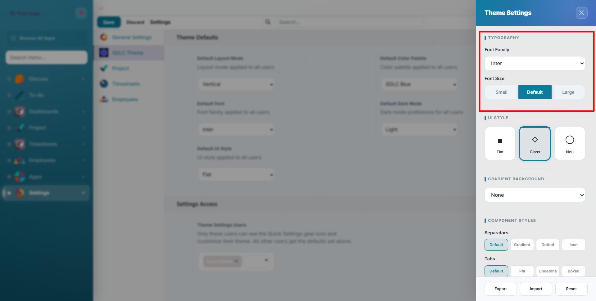
| Font | Style |
|---|---|
| Inter | Clean, modern sans-serif (default) |
| Roboto | Google's Material Design font |
| Poppins | Geometric, friendly |
| Nunito | Rounded, soft |
| Open Sans | Classic, highly readable |
| Lato | Professional, balanced |
| Montserrat | Bold, geometric headings |
| Raleway | Elegant, thin-to-bold range |
| Source Sans | Adobe's open-source workhorse |
| DM Sans | Compact, contemporary |
| Work Sans | Optimized for screens |
| Plus Jakarta | Modern Indonesian-inspired |
| System | Uses your OS default font |
Font Sizes
Three size options control all text proportionally:
| Size | Effect |
|---|---|
| Small | Compact text: fits more data on screen |
| Default | Standard Odoo sizing |
| Large | Easier to read at a distance |
Component Styles
Customize the appearance of common UI components from Quick Settings:
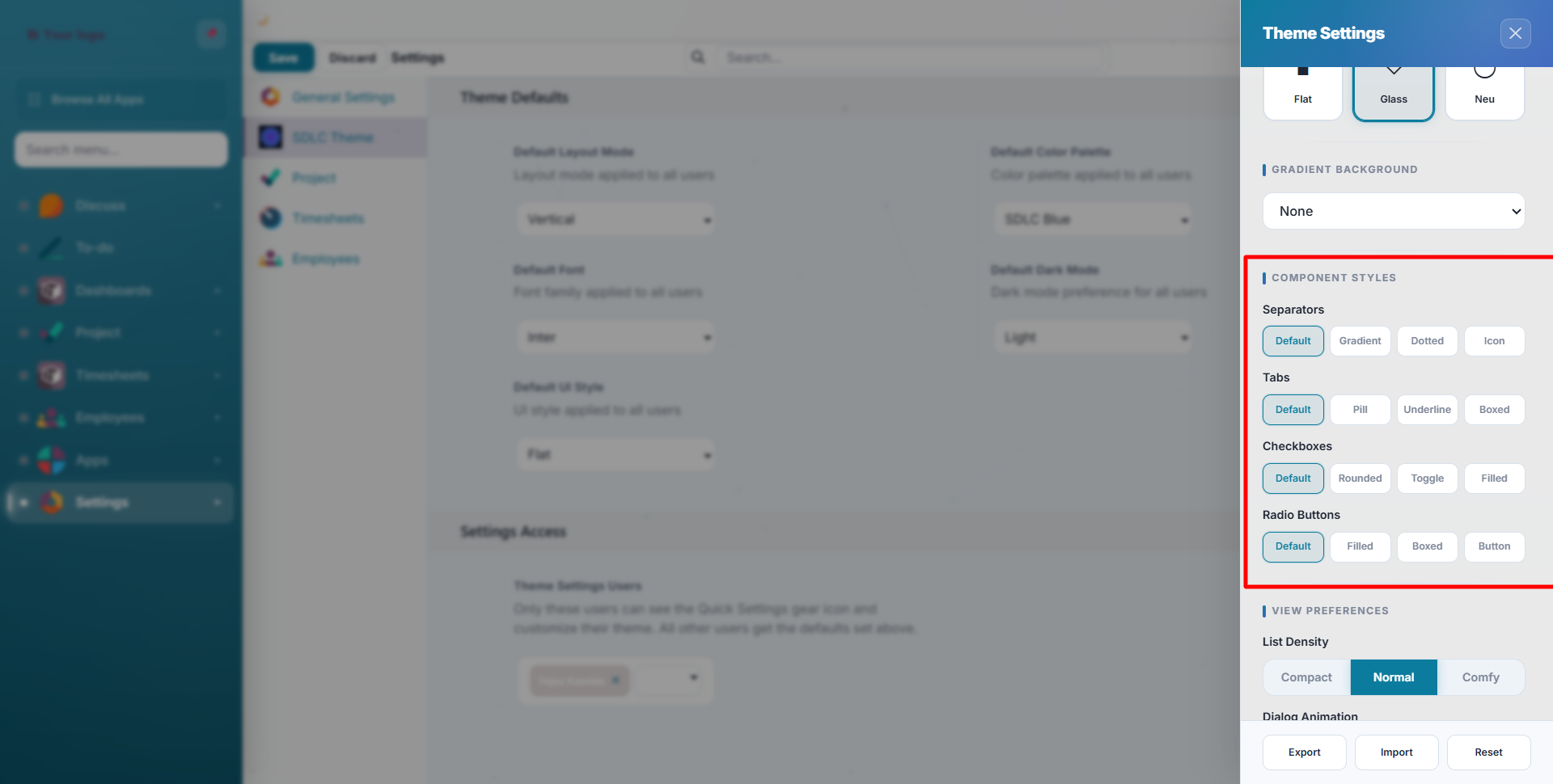
Separators
| Style | Description |
|---|---|
| Default | Standard horizontal line |
| Gradient | Colour-fading line |
| Dotted | Dotted separator |
| Icon | Decorative icon divider |
Tabs
| Style | Description |
|---|---|
| Default | Standard Odoo tabs |
| Pill | Rounded pill-shaped tabs |
| Underline | Active tab underlined |
| Boxed | Bordered box tabs |
Checkboxes
Default, Rounded, Toggle Switch, Filled
Radio Buttons
Default, Filled Circle, Boxed, Button-style
View Preferences
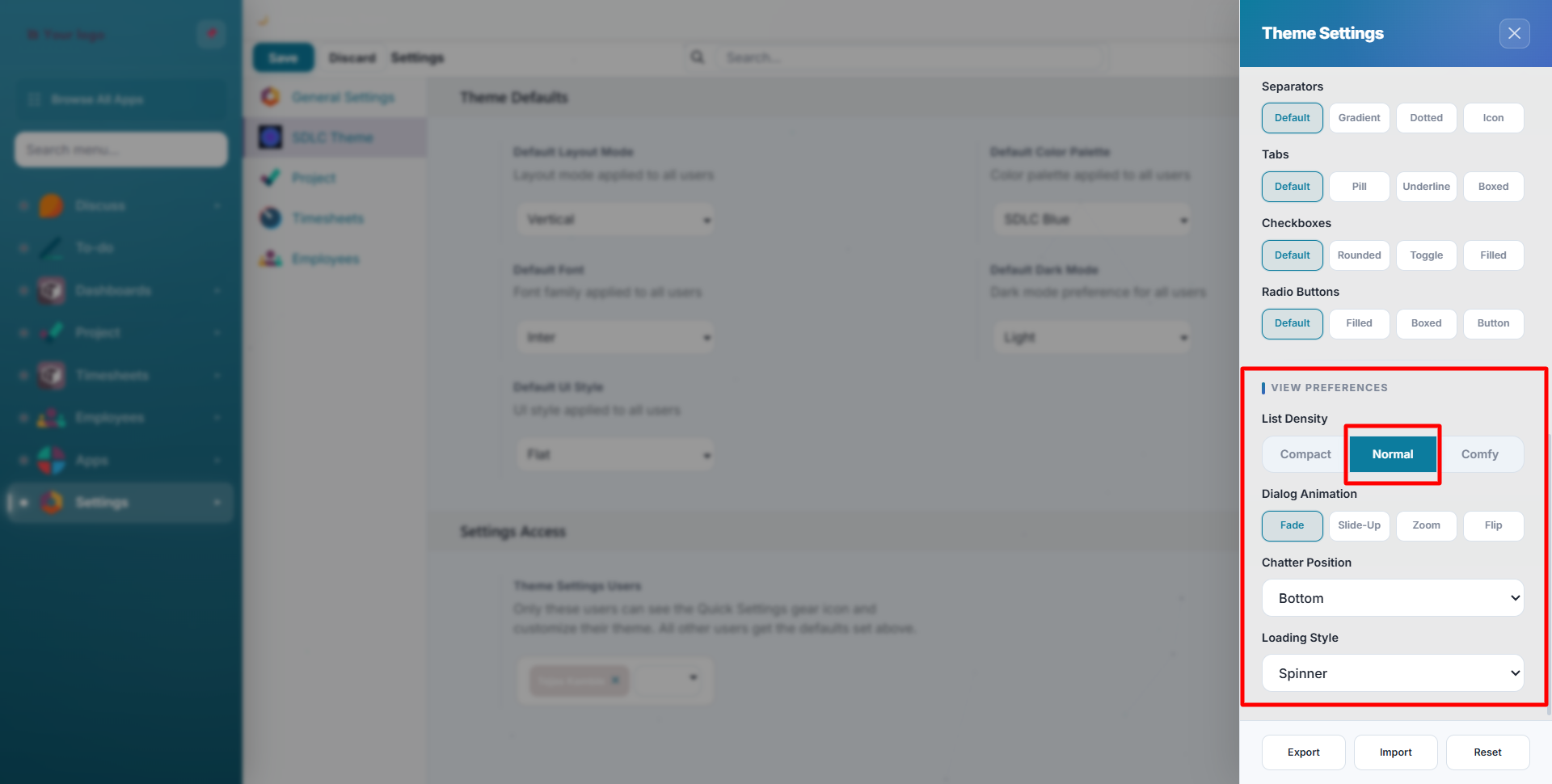
| Setting | Options | Effect |
|---|---|---|
| List Density | Compact, Normal, Comfortable | Row height in list views |
| Chatter Position | Bottom, Side, Hidden | Where the messaging panel appears in form views |
| Sticky Header | On/Off | Keeps the control panel fixed when scrolling |
| Loading Style | 10 animations | Visual style of loading indicators |
| Dialog Animation | Fade, Slide Up, Zoom, Flip | How modal dialogs appear |
Contact SDLC Corp at sdlccorp.com/contact-us or email sales@sdlccorp.com